


Your pricing page is your make-it-or-break-it moment to drive a purchase or motivate an interested party to book a meeting with your sales team. It is supposed to show the best you have, provide key information for your customers, and answer any open questions that might still linger in the air.
But what makes a pricing page work? No need to re-invent the wheel, with the following best practices and standards, you can create something that is clear, to-the-point and transparent – and drives your conversion rates.
Simple at the top, detailed at the bottom #
It’s a delicate balance to be transparent with your pricing and plans without overwhelming customers with too many details, numbers and footnotes.
A tried-and-true approach follows the logic of news writing: you start with the most important information and then work your way through the more complex details.
How does that look on a page? Add a very simple overview of your plans at the top of the pricing page and then follow it up with feature comparisons, FAQ, rates and fee documents (if applicable) and more.
Keep your pricing page design simple
Design is an integral part to your pricing page, because clarity and transparency also depend on the way your page-layout is structured and how easy it is for page visitors to see everything important at a glance and navigate through the page to find the information they need.
Simplicity is important. Yes, you should highlight the “best” plan or price. Yes, you should have call-to-actions. Yes, you should have feature comparisons and more. But all these elements should not overwhelm the visitor. Contrasts should be used sparsely to highlight the most important things. Remember: if everything is highlighted, nothing is highlighted.
Try to work with your web designer to create an information hierarchy the design should follow. Try not to add too many different fonts, colors and shapes, otherwise the page visitor might miss the forest for the trees.
Step 1: Choose your subscription plans #
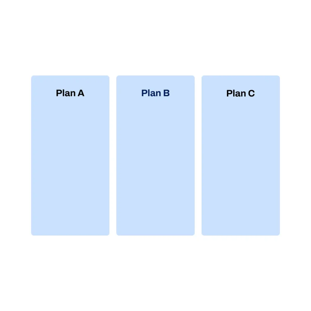
Pick 1-4 subscription plans that your customers can choose from.
Purchase decisions decrease drastically between number of plans:
- 1-3 (100-97%)
- 4 (74%)
- 5 (49%)
(Source: hy via OMR)
Step 2: Configure the right order #
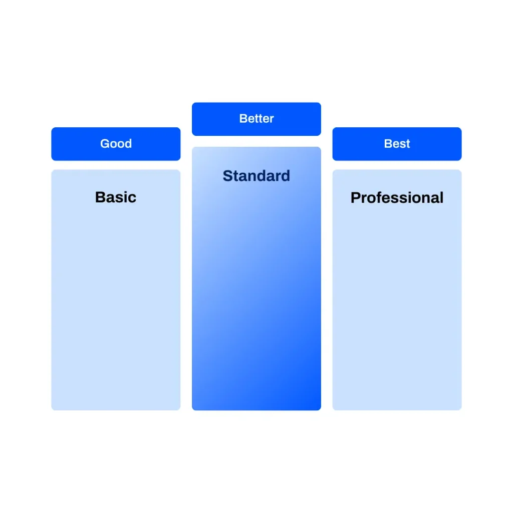
A tried-and-true approach is the “Good-better-best“-model that places the “cheapest” option to the left, the standard option in the middle (usually, that will be your bestseller) and the “best” or most expensive option (in B2B often the enterprise version) to the right.
- Good: A very basic plan with a limited set of features at a very attractive price
- Better: A standard plan with all important features for a medium price
- Best: A “luxury” plan with extra features, more user accounts or special service level agreements at a higher price
This is also called the “decoy effect”, which basically means that you cushion the plan you want to sell the most (standard) between a plan that doesn’t offer a lot of features (basic) and a plan that is quite expensive (enterprise/professional).
In comparison, the standard plan will look just right. It’s a bit like the Goldilocks fable!
Mark your best deal with a contrasting frame or tag with a small info such as “best deal”, “our customer’s favorite”, etc. It needs to be visually highlighted and ideally in the middle of the page, to draw the eye (and make comparisons between the cheaper and more expensive option easier).
Step 3: Be smart about your pricing #
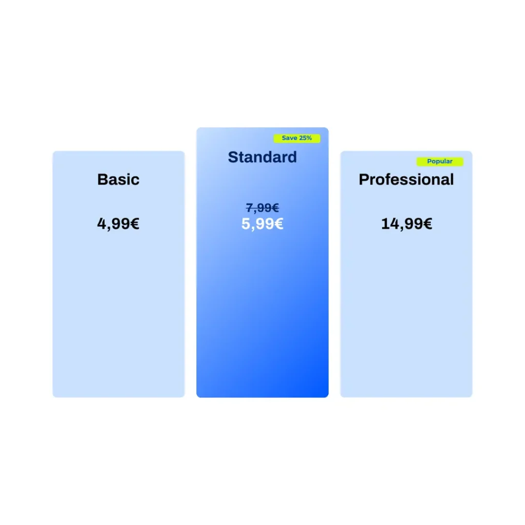
It’s a cliché but it still works: prices ending on “99” perform better than even prices. Additionally, make sure that the value of the plan fits the price.
Price jumps need to make sense to the customer, no matter how logical they are economically for your business.
We would have shared benchmarks but any pricing expert will agree that there is not a defined percentage that works best since it’s all about the price sensitivities of your customers and the value of your product.
Discounts for anything below 100€ sound more valuable in percentage than in monetary value.
Step 4: Summarize the plans’ value #
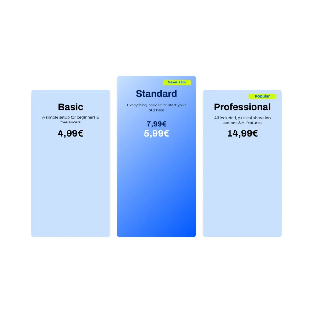
Make sure to use the right messaging for the respective target groups in a simple tagline at the top of each plan to make it easy for users to decide. Keep it short and to the point.
An example for a marketing software:
- Basic: Start immediately with a simple setup for content creators & freelancers
- Standard: Everything needed for marketing managers & agencies
- Professional: All included for big teams (including collaboration options & AI features)
Step 5: Offer annual and monthly prices #
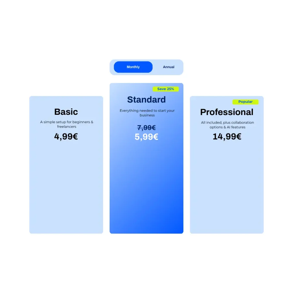
Annual
Usually used for price-sensitive customers that don’t need to be convinced of your product or service but are confident that they will use it for that amount of time. Annual subscribers provide a lot more security and revenue stability which is why so many annual plans come with a generous discount. An annual plan makes sure that your customer lifetime value is at least a year long.
Monthly
Usually used for price-sensitive customers that also value flexibility (e.g. because they switch between different providers or want to test out the subscription before committing to an annual plan).
Emphasize annual payment discounts
Showing both monthly and annual prices give customers a better overview on cost savings (in case they go for the annual price) and monthly expenses (since most B2C customers plan a monthly budget for subscriptions even if they opt for the annual plan).
Step 6: Provide an overview of key features #
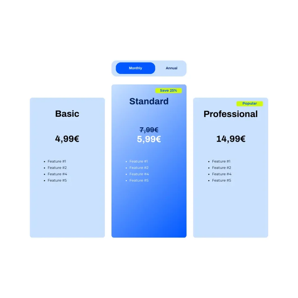
Add your key features and advantages for each plan to the overview and make sure they are aligned across all plans, so it’s easier to compare plans and their value.
These key features can do two things:
- They show the main value of each plan at a glance, so make sure to concentrate on features and perks that are key reasons to subscribe.
- They can also communicate why a pricier plan might be more attractive (e.g., a basic plan might only offer one seat or limited AI uses). The easier it is to see the differences, the more likely a page visitor might opt for a higher-tiered plan.
Step 7: Don’t forget your call-to-actions #
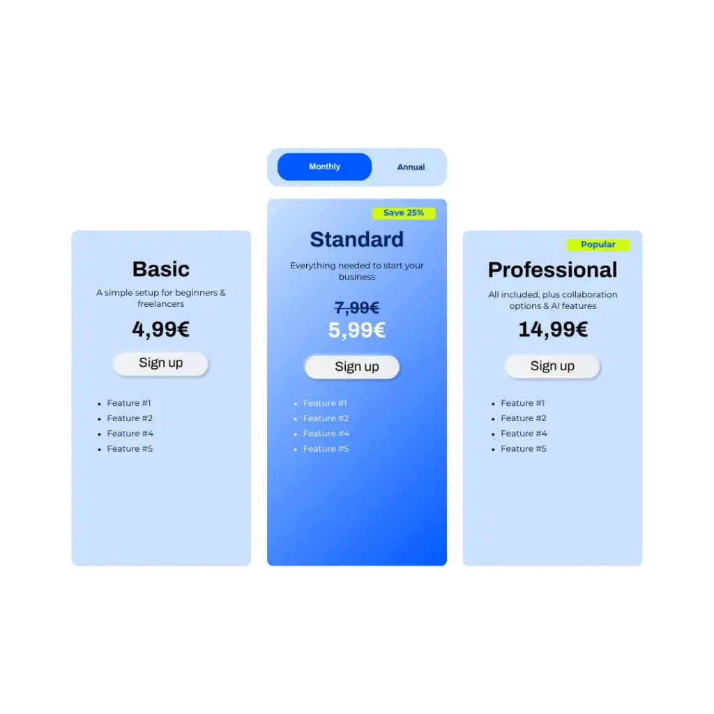
Make sure that you offer next steps such as a free trial, an interactive demo or a meeting.
These next steps should be all aimed at making a purchase decision, therefore, we do not recommend CTAs that lead to awareness content such as white papers or high-level webinars.
Some general tips for your CTAs:
- Make them stand out (e.g., as buttons with contrasting colors)
- Create hierarchies, so different CTAs don’t compete for attention (e.g., make the signup-CTA bolder than a “watch live demo”-CTA)
- Create urgency with limited offers (“Sign up now for a 5% discount”)
- Don’t forget mobile responsiveness
Step 8: Add a comprehensive feature comparison table #
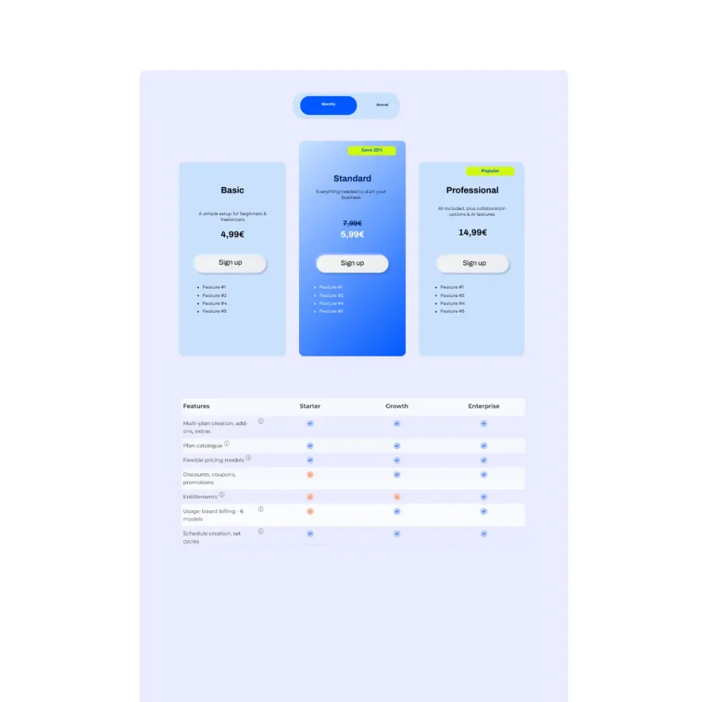
If potential customers have more specific requirements and want to make sure they get everything they need, they will require a more detailed list of features per plan for comparison.
A clean table that lists all important features and shows which plan offers them to what extent or where the fixed price might be combined with usage-based features (e.g. 10 video downloads with the basic plan vs. 50 with the standard plan).
If you don’t want to intimidate casual pricing page visitors with a long table, you can use a table design that either pops up, can be scrolled in an individual window or can be expanded.
Step 9: Add social proof to your pricing page #
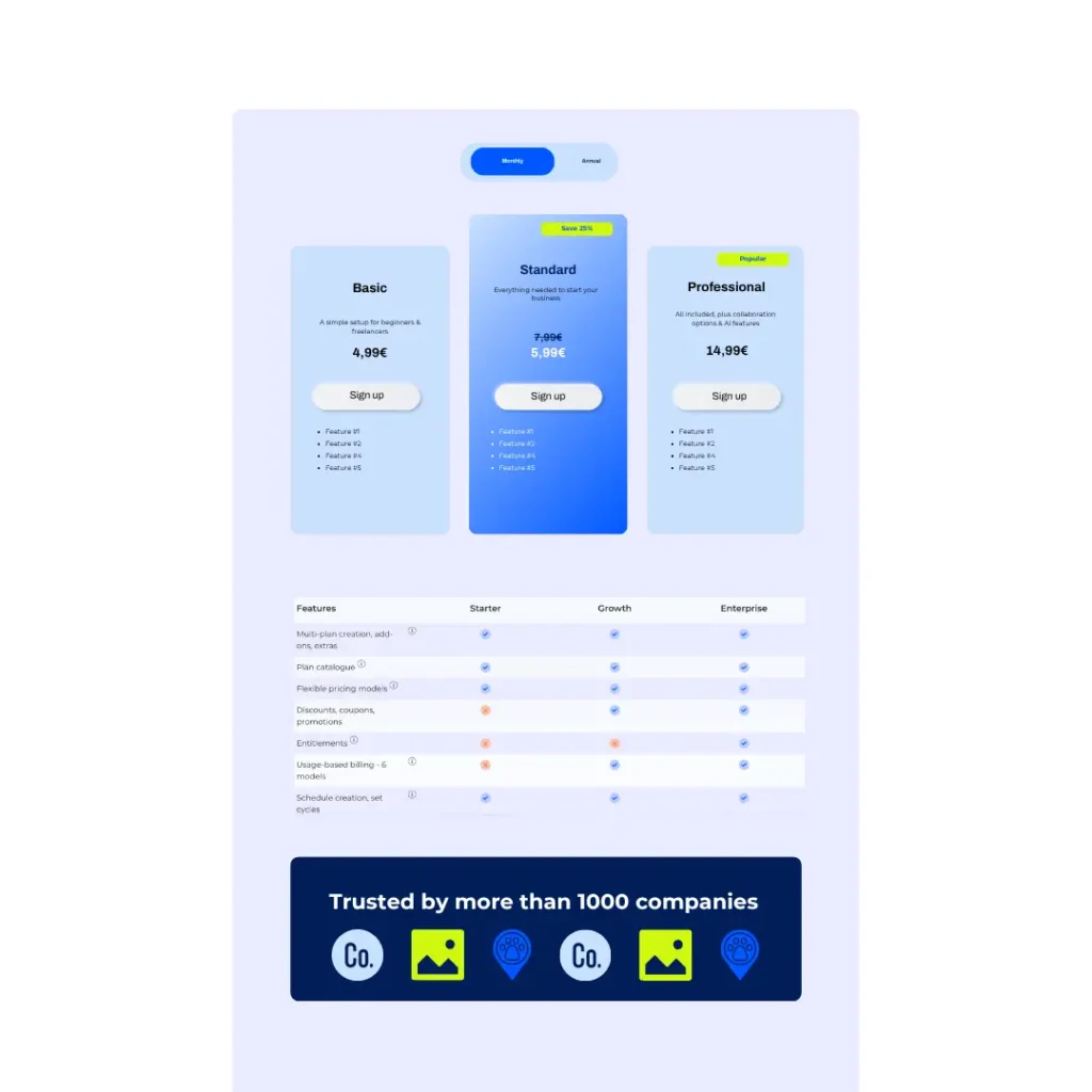
Social proof is mostly external information that speaks to the quality, security, compliance or innovation of your products and services:
- Customer logos
- Customer quotes
- Compliance & security certificates
- Review platform badges
- Innovation & other company awards
If your social proof section is fairly big, we recommend adding it below the most important information sections of your page (e.g. underneath the pricing overview and feature comparison).
Sometimes, a slim logo banner is all that’s needed since page visitors who require more detailed social proof might visit other pages of your website anyways.
Step 10: If required: add an FAQ #
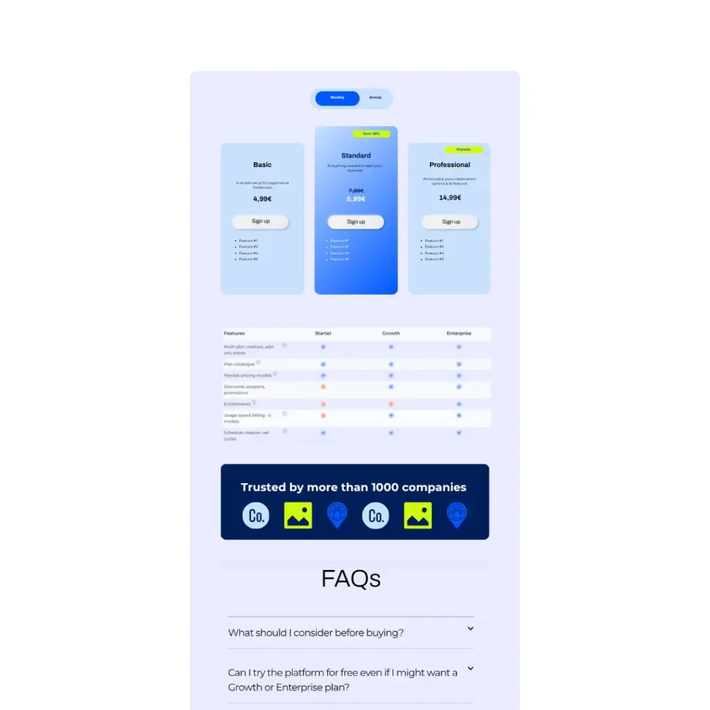
Ask your sales and support team about regular questions that customers might have and answer them in your FAQ to reduce time and effort until the purchase.
Make sure, the FAQ actually address questions your customers might have by aligning with your sales and support team and collect real issues and concerns.
Typical FAQ topics:
- Pricing & fees
- Billing
- Cancellation policies
- Requirements
- Information about seats & adding seats
- Support
- Compliance
- Free trial & freemium specifics
Step 11: Measure & optimize your pricing page #
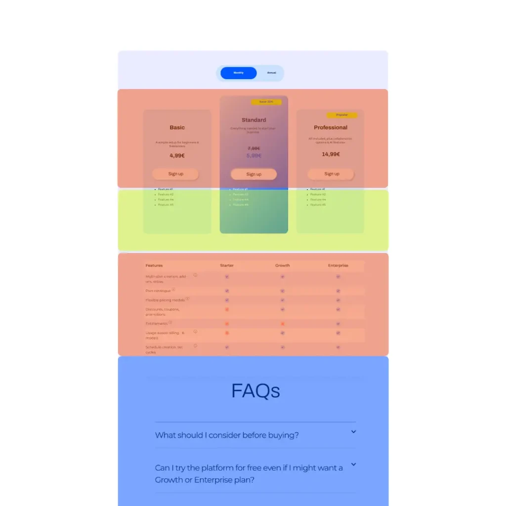
Measuring your page’s success can help you optimize it further. Heat- and clickmaps can identify unclear or unnecessary sections.
Your conversion rate for different CTAs (signups vs. demos) can also show you if customers might require more info to make a purchase decision.
Make sure to contextualize your findings.
For example, see if page visitors leave the pricing page or convert. If they leave, find out if they bounce (leave your website) or move to another page. The latter could indicate that they require more information that they could not find on the pricing page.
The former does not necessarily mean something bad but could imply that they are not yet ready to make a decision (e.g. are still in the research phase). You could target these page visitors with an ad campaign to keep your brand on their mind.
Increase your conversions with Frisbii #
As your partner for subscription management, the Frisbii recurring billing platform provides you with easy, no-code pricing pages that are based on your subscription plan setups and can be customized to highlight plans, add discounts and more. Go live in no time without any development resources required.
Frisbii automates your recurring billing, supports flexible subscription management and provides you with a wide variety of options to set up plans, discounts, manage fixed or usage-based pricing, combine plans with add-ons and more.
We are a European provider and therefore fully compliant with GDPR, PCI DSS and GoBD to make sure your subscription billing can run smoothly in the background and provide accurate data for your finance team and accounting software.
Sign up for a free test account to see how easy it is to set up. Test our no-code pricing pages, dive into our many options to localize your subscription plans and payments and go live in no time.
You don’t know what setup is best for your business or migrate from your current solution? Our sales team is happy to consult and help with a plan to successfully grow your subscription business.
